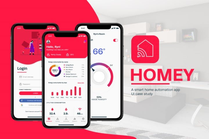
Homey
Smart Home Automation App
There are lots of smart home brands and every brand has different applications that only works for its designated devices. User will install different applications for each brand that confuses them. That’s where Homey comes in.
Homey is a smart home automation application that aims to make a functional and universal control of a smart home. Additional features such as smart scheduling, mood profiles, and real-time data consumption of devices also elevate the application’s usability. This application could save time, memory, and space on mobile devices.
- Overview: In this project, I focused on delivering a data visualization and user experience design.
- Constraint: One week deadline
- Platform: iOS specifically iPhoneX and above
Userflow

Style guide are derived from iOS guideline which was based on clarity on elements, deference in motion and hierarchy and facilitate understanding while applying my research on previous portfolio project.
Style guide

Colour
Clash colour scheme is mainly used for the design process with an analogous color scheme as extra colours.
The colours picked for this study are lively and vibrant that set the mood for love, passion, and futuristic for smart home applications. The midnight blue and light grey are used to take place the black and white to make it less serious. Purple serves as an accent colour that can be used as the main colour when in dark mode. Extra colours are used to create more vibrance and liveliness. It is also used to showcase classification on a graph.
Typography

Runda is a neo-grotesque typeface that offers contemporary designs. Runda was used in the entire typeset. Though it has only 4 families, it was good enough to cater to the applications without making complicated guidelines for future use.
Iconography
Icons used are geometrically done in an outline style on a unified scale based on Material Design Icons. Icons change colour depending on the state they are in such as pressed disabled and default state.
Components

Logo

The logo is composed of geometric shapes that form a house. The concept is as a house, a link and circles representing the end to end connection and communication from point A and B.
UI Design
Splash Screen, Onboarding & Login Screen

Homey contains these windows to showcase a human interaction experience to welcome the users.
Dashboard

It is where the user lands after opening the application. Inside is some quick actions and a quick overview of consumptions.
Devices

Where devices are being added and controlled. This is also where devices are located and classified into rooms.
Automation

Automation is where scheduling happens and when to activate such a trigger. It also features a mood profiling system where the user can set the mood ie party or movie time.
Statistic

This section of the application is where data are visualized. It generates data to show yearly, monthly, weekly, and daily energy consumption.
Settings

Lastly, the setting is where you can edit your profile and account, change the behaviour of the app.
Prototype
Mockups
