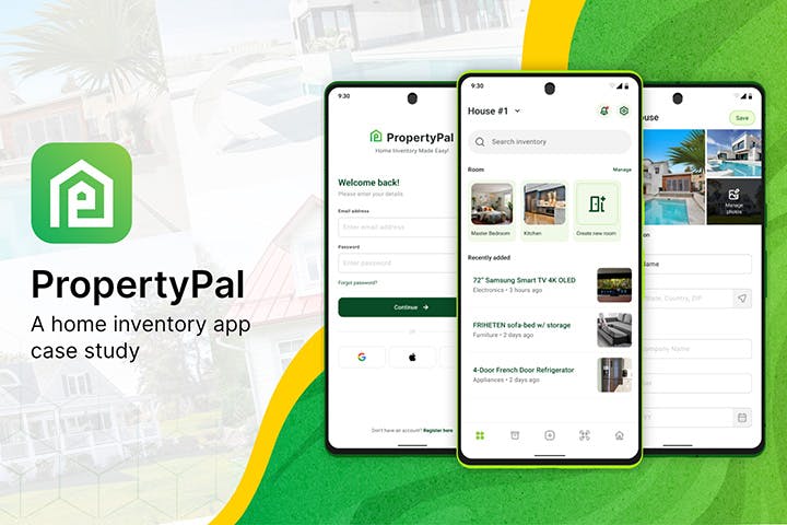
PropertyPal
Home Inventory Application
Many homeowners struggle with keeping track of their belongings, making it challenging to accurately assess their property's value and adequately document items for insurance claims in the event of theft, damage, or loss. There is a need for a user-friendly and efficient app that enables homeowners to create and manage a comprehensive home inventory.
PropertyPal is designed to help users manage and organize their personal belongings within their homes. The app allows users to create a comprehensive catalog of their belongings, including descriptions, photos, purchase dates, and values. The app aims to simplify the process of creating and maintaining a home inventory, making it easier for users to track their possessions for insurance purposes, organization, and peace of mind.
Goal
✅ Simplify the process of creating and updating a home inventory.
✅ Enhance user experience by providing intuitive and user-friendly interfaces.
✅ Enable users to easily categorize and search for items within their inventory.
✅ Facilitate the inclusion of photos and relevant details for each item.
✅ Provide a secure and reliable platform to store & access inventory data.
✅ Support users in generating reports and exporting inventory information when needed.
Case study
Information architecture

Low-fidelity wireframe

Style guide
The user interface follows Material 3(You) Design that was created by Google however with few adjustments to leverage the look and feel. Instead of going for Google’s Material You color palette, I picked a more vibrant color, as for the surface and its variant, I went for a more lighter color. On the other hand, I used same old Roboto typeface.
Colour

Typography

Iconography
Unicons are open source icon set created by IconScout. The set icon uses 24px base in a 2pt stroke with rounded edges.
I choose Unicons for this project because of its modern style. Was about to use Material icons but it gives me that stock AOSP look. Apple’s Symbol was also a concept but it can not be used for commercial and it just weird using it for an Android application.
- Some icons were custom made since some are not available on Unicons
Logo

UI design
Onboarding

Multiple authentication: Give user the freedom to connect either by email, Google, Apple or Facebook and even without account.
Quick onboarding: Userflow for onboarding follows a sequence of simple app description then login immediately.
Dashboard

Quick access: Provide quick access to the app important functions such as search, manage room, recently added items. Quick swapping of properties were also included on the header.
Navigation bar: Uses 5 navigation functions such as dashboard, inventory, add, storage and house information. Adding items can easily be done by tapping on the middle add icon which ask user if they are uploading using camera or gallery. I went for this approach since its commonly used on other big applications like Instagram and LinkedIn so there is not much of a learning curve.
Notification Badge: Shows a notification badge on the top right corner if user does not completed an inventory item form. (Explained use case on inventory screen)
Importing item

Capture once, edit later: The idea is to take multiple photos in a step then edit them afterwards. A pain point from other applications is that after capturing an image, user will be asked to fill the information required before taking another item again. Then transport back the user to step one. Its a bit repetitive process and that’s where this app shines.
Accordion list: Captured photo will be listed in an accordion like card (see screen 3) where user will input item details. User can add more item by tapping on the FAB button. The custom accordion card can be shrink/expand. When expanded, it gives more option to fill with additions of MORE DETAILS and DELETE.
Less requirement: Another pain point to address from other application is that their form field have a lot of requirement to fill before saving(eg. title, price, quantity, category etc). PropertyPal only required item name to be filled. To not confuse later on for filled and not yet, a PENDING text status will be added to items that are incomplete.
Inventory

Pending filter: User can filter the inventory list with PENDING to just shows incomplete item.
Less scrolling: Since there are a lot of textfields on item details and cause the app to be cluttered and harder to on-scroll navigate, we can solve it by simplifying textfields to less height for easier navigation of the app. Thus it will also show all the textfields at once without scrolling.
Storage

QR Code: Storage QR Code is currently being hot stuff for millenials. Found on Instagram on how user like the idea of organizing their unused stuff on a storage bin.
User can scan the storage QR code label and will show all the items inside.
House information

Essential information: Shows a summary of inventory count, total value and how many rooms. It also provides insurance information in case of emergency.
Report PDF also provided.
Multiple photos: Allows multiple photos of user’s property.
Room management

Easy item room addition: Uncategorized item will be listed and can easily be added in just a single tap.
Non-destructive: Deleting a room will not delete the item from the inventory but rather return them to pending status.
Other Screens

Settings: Settings have profile, security settings and about the application. There is also the logout button at the bottom of the list.
Profile: User profile is not focused on the application since it does not have a good use case to show it up (just for credentials only)
Notification badge: Items that were flagged with PENDING status can be accessible via notification area.
Monetize: Subscription based model can be added as well.
Mockups
